SOJOURN
OVERVIEW
A platform for Sojourners away from home. Accommodation reviews app in a more humanized way through video reviews and interactive photos while taking in account the cultural differences and preferences of people.
This project is part of my coursework under the Allvr Product Management Fellowship.
ROLE
Product Designer and Manager
Product Strategy, Product Conceptualisation, Visual Design, UI/UX Design
DURATION
Nov 2020
My Backstory
As a university student that has done her fair share of overseas internships, I faced difficulties in finding semi-permanent housing. During my summer vacation of my second year, I was set to go to Jakarta, Indonesia for a 3-month internship. In my preparation for the journey, I faced a major problem –
"How do I get reliable housing despite not speaking Bahasa Indonesia?"
Like any other tech-savvy student, I head on to accommodation booking sites to hunt for my home for the next 3 months. Other than the very obvious language barrier that was barely overcame by good ol' Google Translate, pictures were clearly outdated and reviews were few and far between. There were also no student community that I could seek help from. Feeling clearly frustrated by the entire process, I picked the one that had the most potential – a surprisingly affordable 3 bedroom apartment in a well-off area of Jakarta for five interns.
But that was the start of an accommodation nightmare.
When we first checked in, there were broken tiles on the floor and the water heater did not work. A light bulb blew, then two and three. That is followed by the plug that was connected to the fridge stopped working in the day and all the food spoilt.
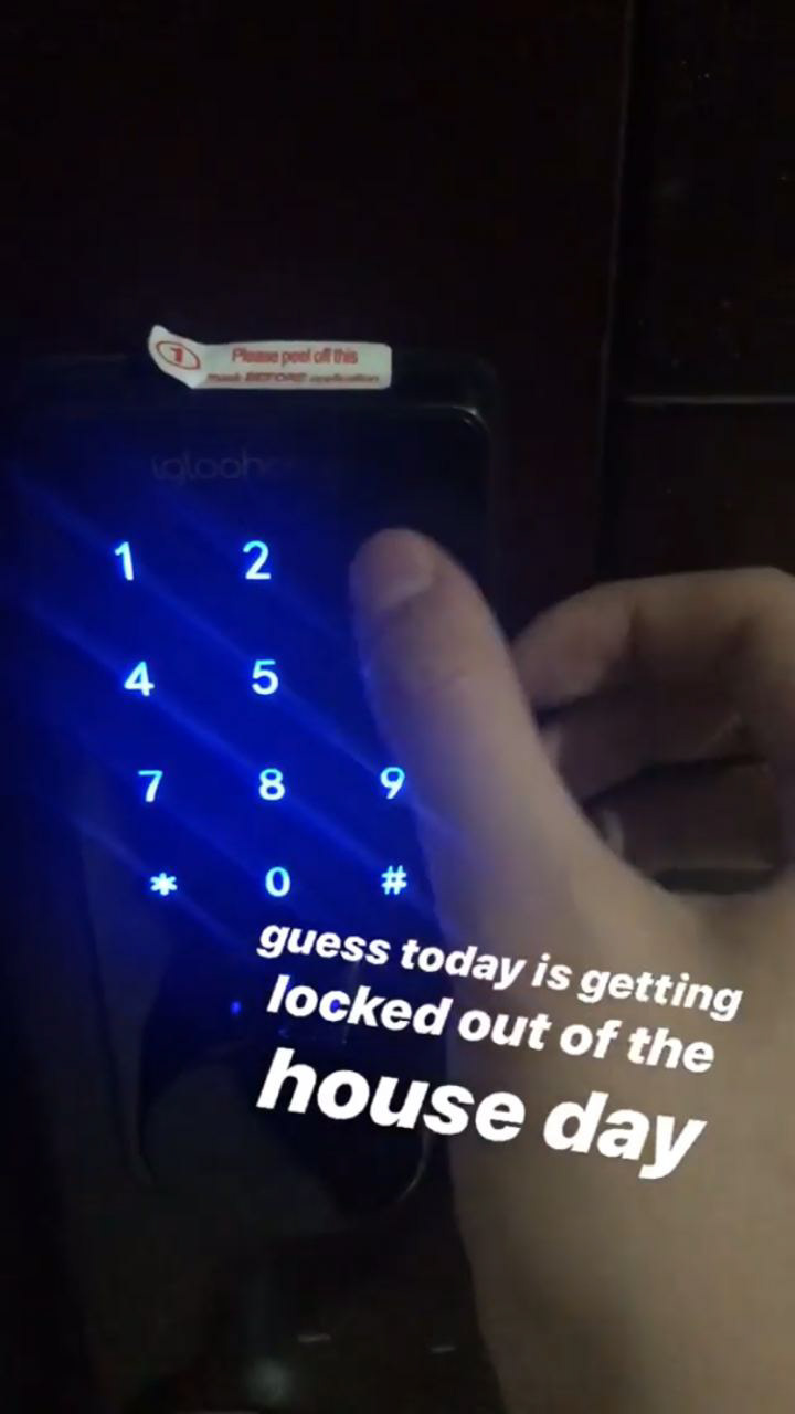
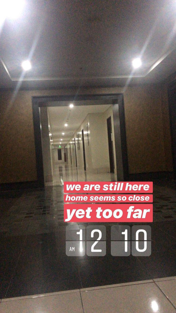
The digital lock of our apartment was spoilt within 2 weeks of us moving in. Despite multiple repairs and sharing 2 physical interim keys among the 5 of us (thus forming an intricate system of who gets to go home first), it kept failing on us, and once locked us out late at night.
Dealing with customer service by the booking site was exhausting. Every request for repair is met with long waiting times and unresponsiveness from the owner. With items in the apartment breaking down week by week, we asked for a relocation. Yet, we were rejected and had to stay put because we didn't read the fine print.
Understanding the Problem
And it turns out that we are not the anomaly. Many students and young expats struggle to find good semi-permanent housing. As Sojourners (see below), we are exceptionally vulnerable to housing scams in many countries such as United States, China and Central Europe. Many students fall prey to scams where houses that were rented to the students either do not exist or a far cry from what the pictures portray. These problems also exist for travel tickets for domestic and international travel. Hosting platforms like Airbnb and Travelio do not regularly update the state of their listings and are very dependent on the landlords and providers who may not show the bad parts of their houses.
Defining the User Personas
I led the brainstorming session in our very international team to discover our target users, which falls into 2 segments:
1. Sojourner Segment - Students or young expats looking for a semi-permanent stay.
- They are clearly foreigners and may not have the grasp of the host's language.
- They want to hear opinions from ex-sojourners, especially from the ones that share their home country and culture.
- They also want a check and balance system that protects them from falsehoods from the place that they are renting from (outdated pictures, broken appliances, dangerous environments etc).
2. Landlord Segment - People with additional properties looking to rent to others on a semi-permanent basis.
- They want reliable tenants that will follow the rules and not mess up the place.
As current solutions such as AirBnb and Travelio greatly served the landlords more than the sojourners, we will focus on the Sojourner segment more in our solution.
Defining the MVP and Prototype
I led a quick design sprint to ideate on the key features that our solution should include.
Solution:
A regularly updated platform with accommodation reviews in a more humanised way through video reviews and interactive photos. It will also take in account the cultural differences and preferences of people coming from different cultures.
1. Search and Listings - User is able to search and browse through listings based on country, duration and ratings
2. Mandatory Contact before purchase - Before a sojourner pays a deposit, the host is contactable and able to give tours around the house to ensure no scams.
3. Detailed Reviews from other Sojourners - Reviews can be filtered by geographically or culturally. Leaving a review is also mandatory.
Designs of Prototype
After deciding on the key features, it was time for me to start designing the screens. The emphasis of mandatory contact and reviews will help the solution becomes a reliable source of accommodation booking platform.
Listings are categorised by recommendations (based on past behaviour) or locations that the user has searched up in the app. Users can also search for a particular location.
Reviews of past travellers are given the spotlight. Other information include location, type of accomodation, ratings, amenities and host contact information.
Chat and Contact Screen
Before a sojourner pays a deposit, the host is contactable and able to give tours around the house to ensure no scams. This can be in the form of pictorial/video evidence or even live chats through integration of in-house chat platforms and video conferencing platforms like Skype or Zoom.
Mandatory Detailed Reviews
Reviews can be filtered by geographically or culturally. Every past Sojourner has to leave a review of pictures and videos of the state of the accommodation, as well as answering some FAQs
Final Takeaways
As the Allvr Fellowship is open internationally, I ended up working with a very international team with members from India, Argentina and USA. This is also the first time that I also took another more managerial role in the team, other than being just the designer. Here is my main takeaway:
See the entire picture. Think macro. - Even though I have seen my product manager back in my internships do this plenty of times, it was my first time to decide what kind of features should be prioritised for an MVP. Especially for this solution, it was hard to avoid being just a copy cat. Hence, it was very essential to keep to the Unique Selling Point (USP) in order for the solution to make sense existing in the market.
With that, I have successfully completed the fellowship programme! For more information about the solution, feel free to check out our pitch deck here.
