SHOPEE
OVERVIEW
This is a UX Case Study and a Redesign Challenge based on the Shopee app.
With 48 hours, I adapted the Stanford d.school Design Thinking process to redesign the Home Tab of Shopee based on its given existing interface with end-to-end design execution. After the challenge, I was offered a Spring Internship from Shopee.
ROLE
Product Designer and Researcher
Product Strategy, Idea Generation. Product Conceptualisation, Visual Design, UI/UX Design, User Discovery and Research
DURATION
September 2020 (48 Hours)
About Shopee
Shopee is one of the largest e-commerce sites in South East Asia. Headquartered in Singapore, it now offers e-commerce marketplace convenience to 8 locations in Asia and South America. s of 2019, the platform recorded 200 million downloads. Its gross merchandise value also surged 72.7% to US$3.8bil in 2Q19 from US$2.2bil a year ago.
The Task: Redesign the Shopee Home Tab
The Home Tab is the face of the entire e-commerce app that will give the user their first impression. Hence, it is important that Shopee ensures a good user experience with an interface that is soothing to the eye will dictate how one will see the entire application.
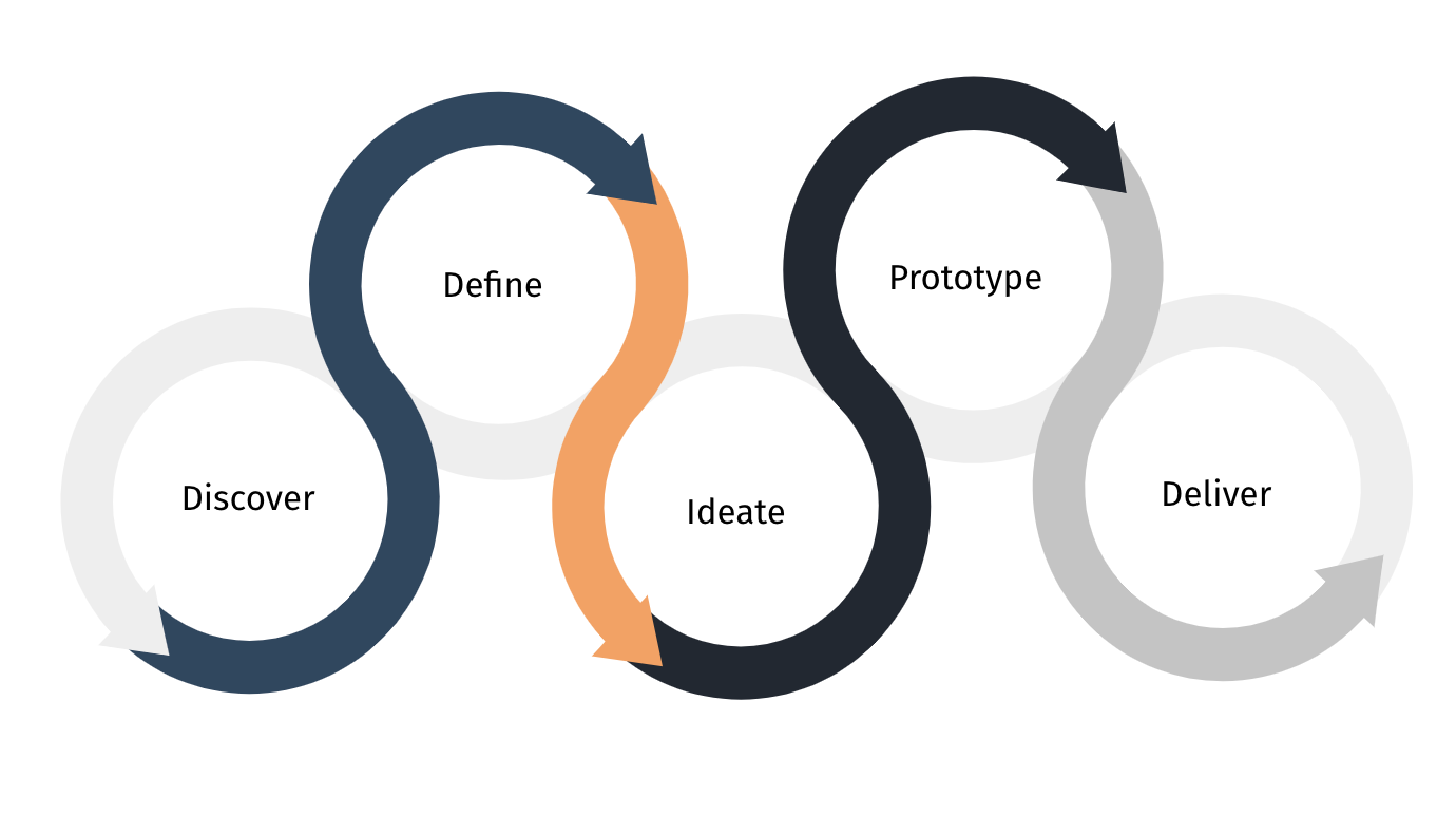
After looking at several design thinking processes, I have adapted the Stanford d.school Design Thinking process to better fit this design task (as there was insufficient time to properly conduct user testing after the prototype was done). Discover was changed from the original Empathize as it will allow for a wider range of research methods, rather that restricting to just user-related aspects.
Step 1: Discover
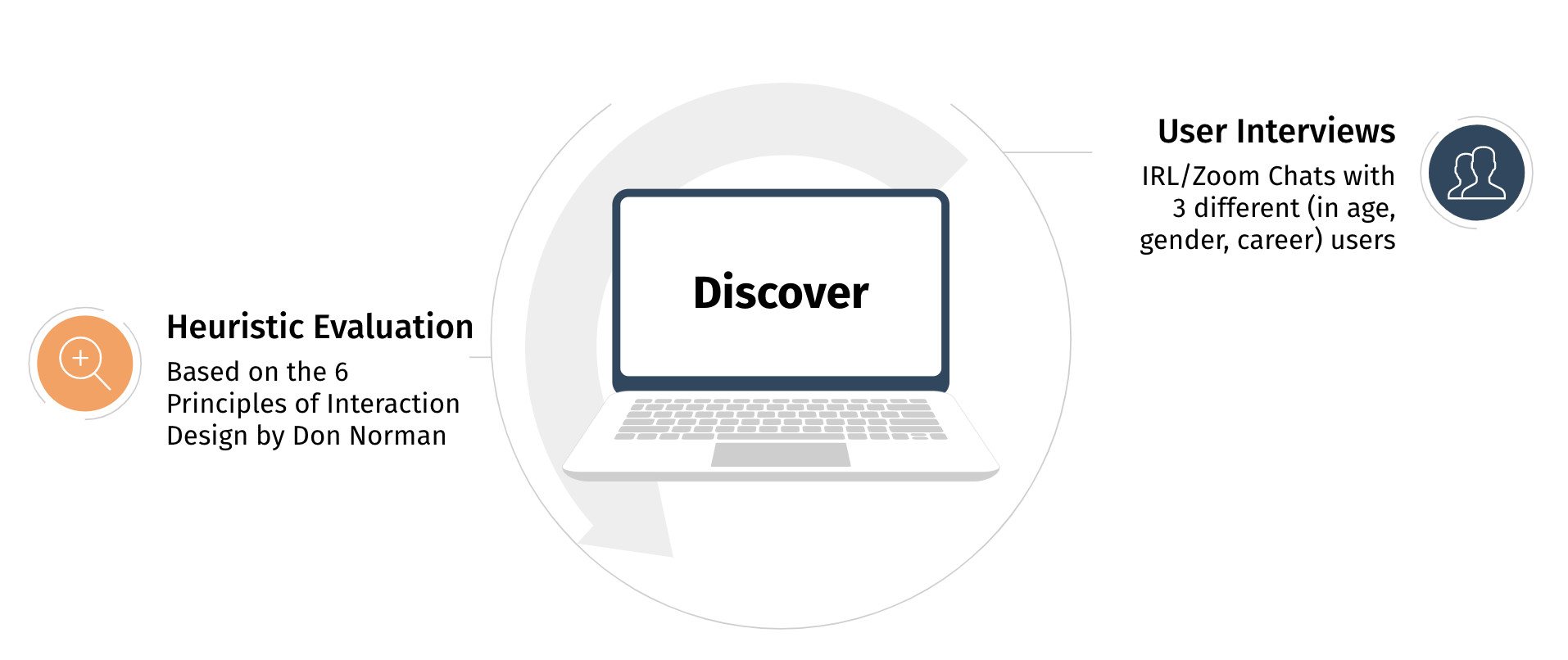
User Discovery Interviews
Due to the time constraint, I decided to talk to 3 people with differing demographics (age, gender, occupation, nationality) and experience in using Shopee and e-commerce sites to capture a spread of users as wide as possible. Each session lasted around 20-30 minutes in a casual setting, where I get the interviewee to talk about their experience on Shopee as much as possible. I also probed accordingly if they particularly mentioned their shopping habits. A summary of the interviews is shown below:
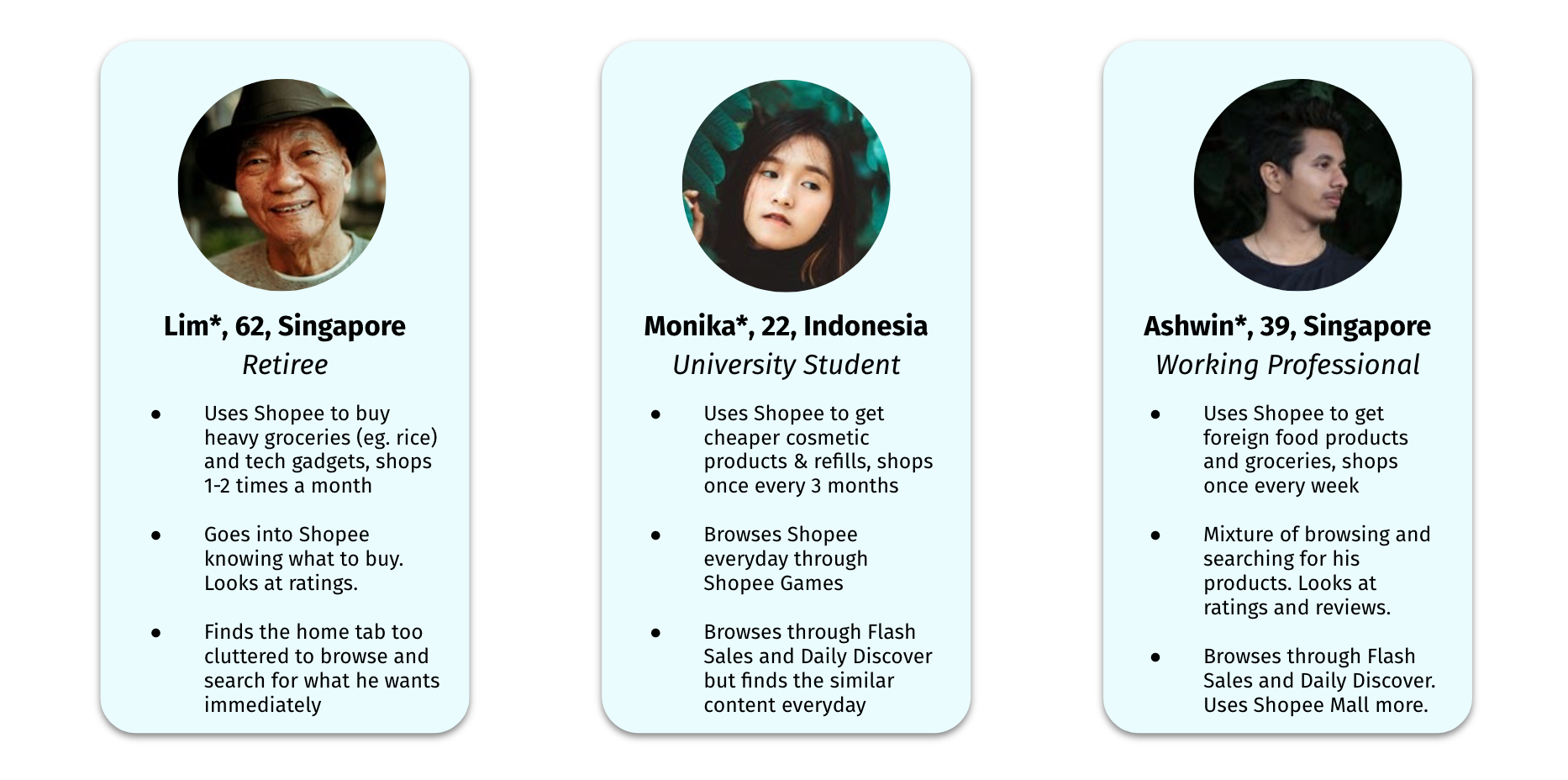
*Names and photos are changed to protect their identities:
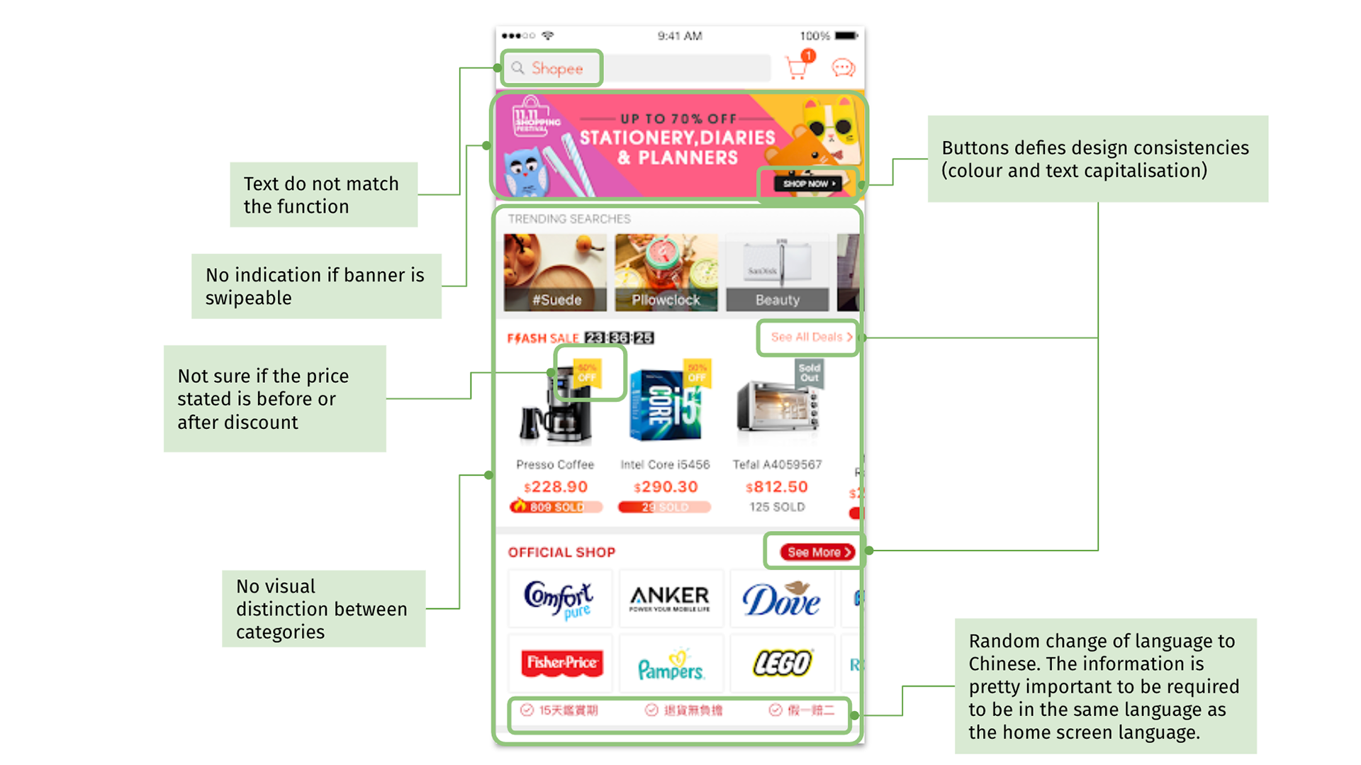
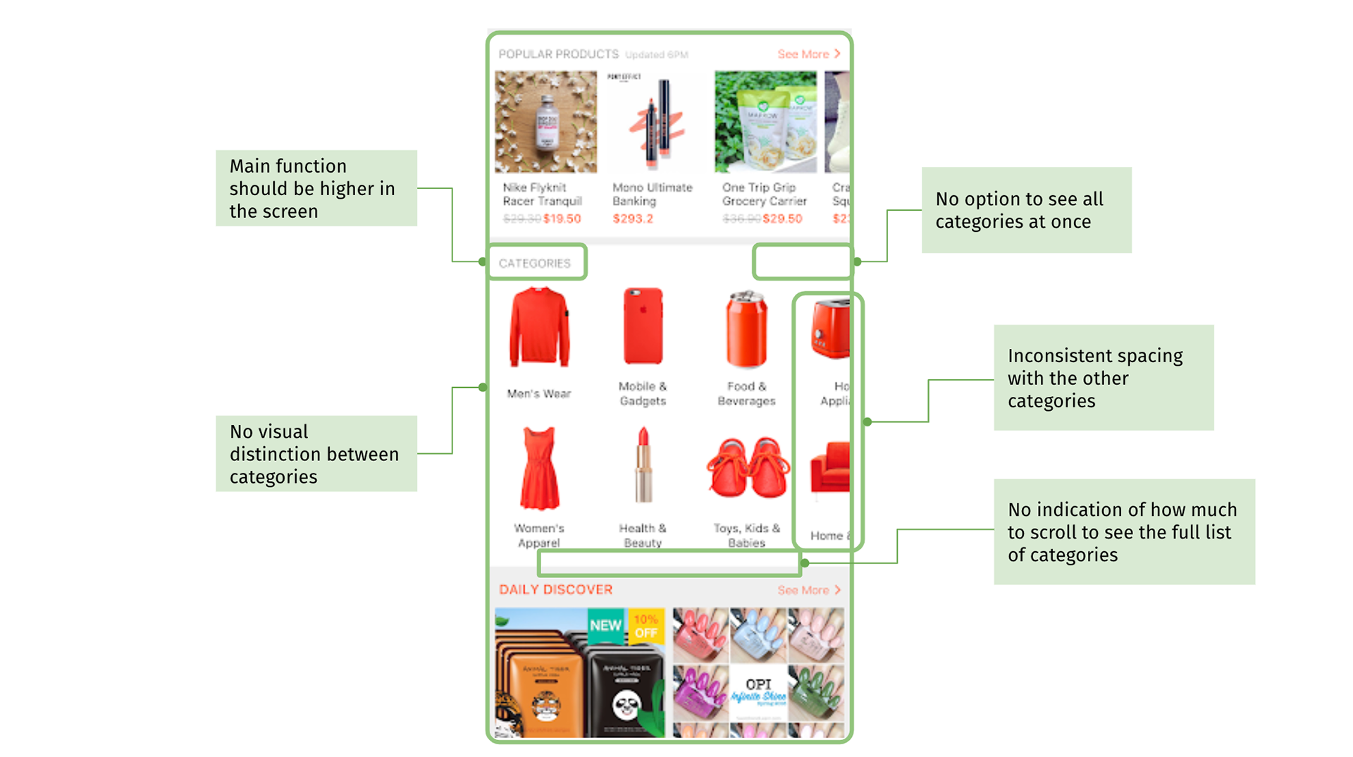
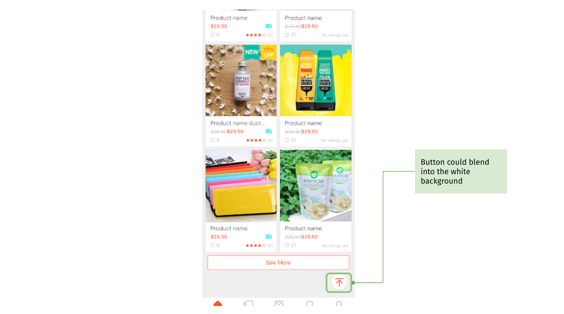
Heuristic Evaluation
For the challenge, I was also given an existing layout of the current Shopee Home Tab. To evaluate the user friendliness from a novice product designer perspective, I based my observations and suggest areas of improvement on the 6 Principles of Interaction Design by Don Norman.
Step 2: Define
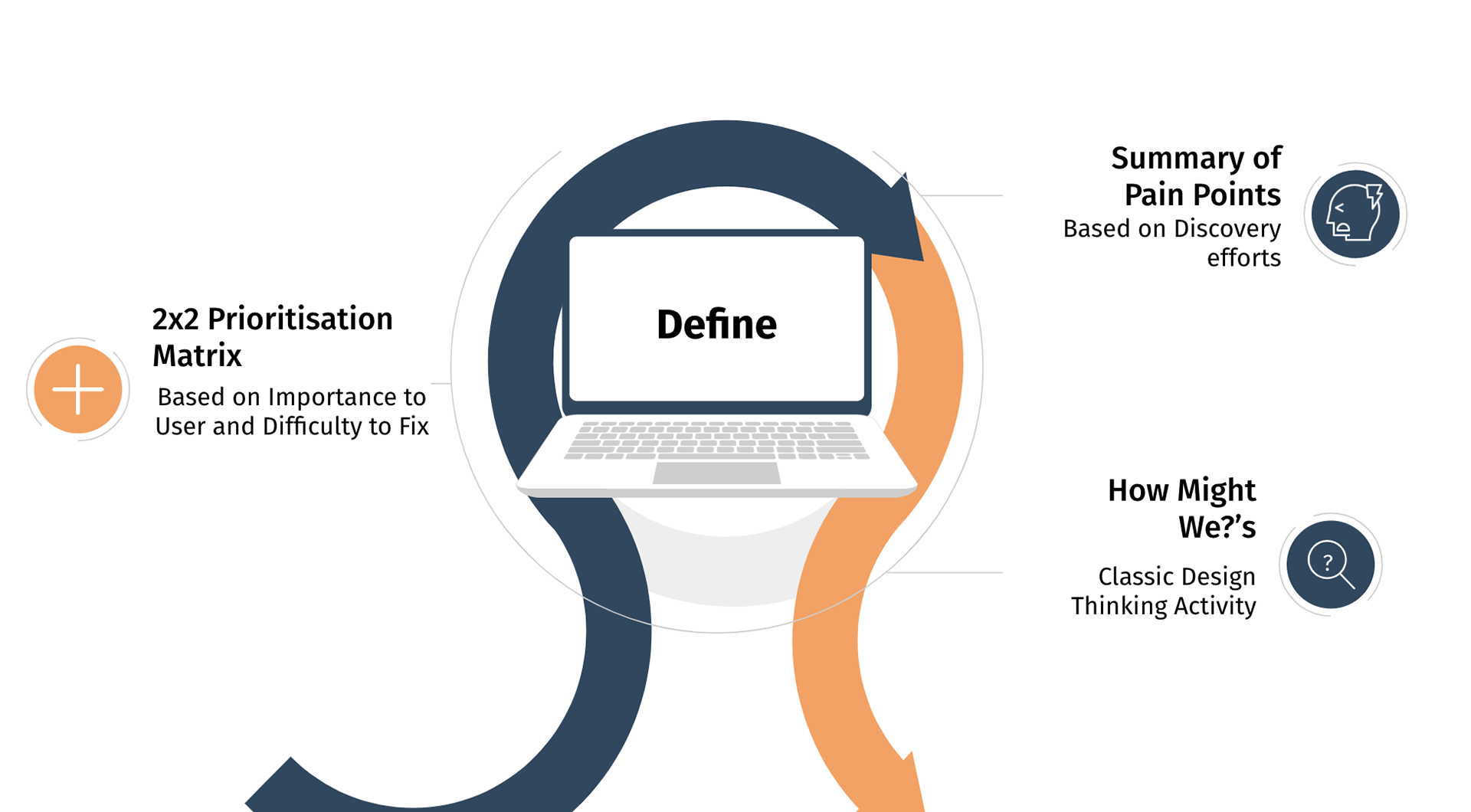
Summary of Pain Points
Once I have finished the interviews and evaluation, I compiled the pain points one Shopee user might face when they decide to shop.
1. The whole homepage looks too cluttered and is overwhelming even for an experienced user.
2. No visual distinction of sections, don’t know where to look or what is important
3. Users have no indication of rewards, hence the savvy buyer will need to go to the rewards section first to know, then plan their purchases or only find out their rewards as they are about to pay.
4. Similar content recommendations shown all the time, which can get boring for the casual browser -- appreciate more regularly updated recommendations
5. No interest in other people’s interests but yet the sections are on the top. -- appreciate more personalised recommendations
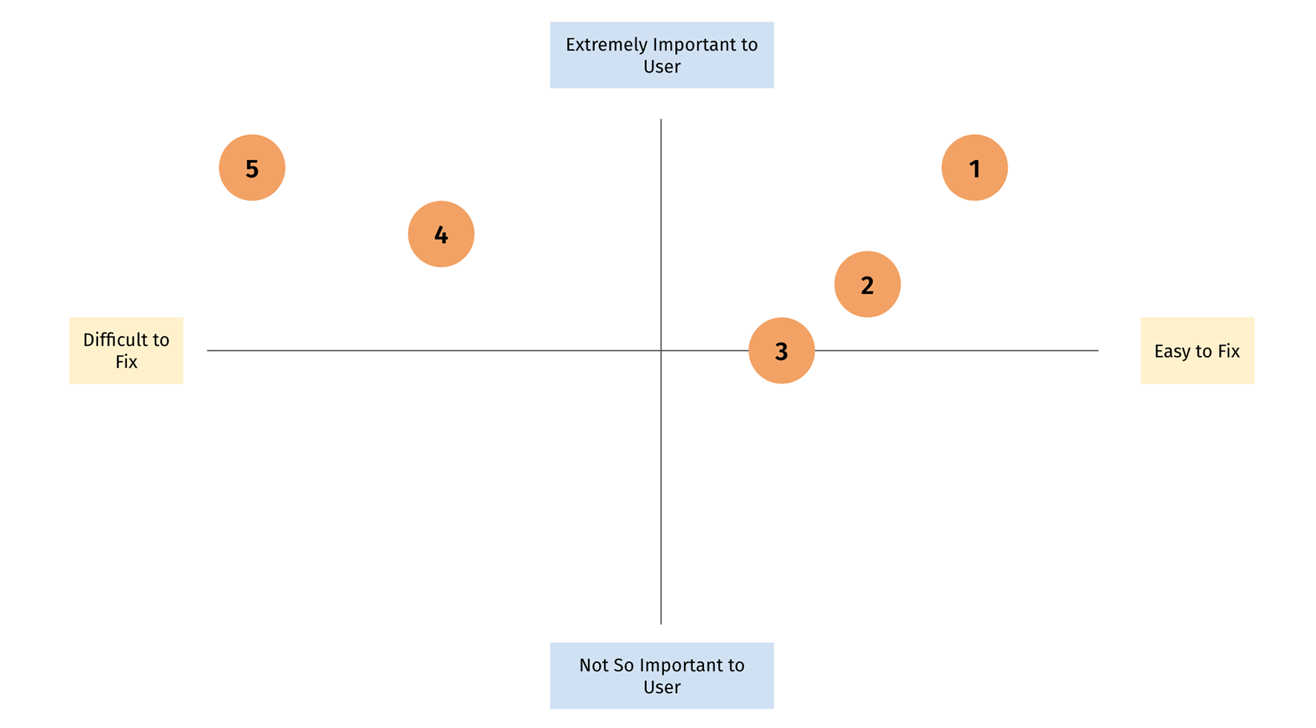
2x2 Prioritisation Matrix
As it is quite unrealistic to redesign in such a short period of time while taking into account the 5 pain points. I decided to prioritise them using 2 factors – importance to the user and the ease to fix (taking into account engineering effort).
How Might We's
To better help me ideate, I used the How Might We (HMW) framework to come up with problem statements.
1. How might we create an intuitive, fuss-free online shopping experience?
2. How might we increase incentivisation for users to shop with us?
Step 3 and 4: Ideate and Prototype
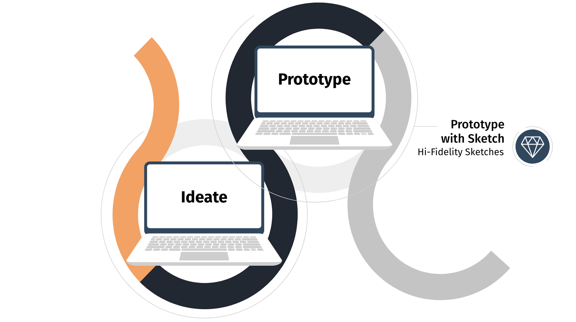
Hi-Fidelity Sketches with Sketch App
I gave myself a strict time limit to come up with visual elements to improve the user experience using the HMW statements. Then, I sketched out the Hi-Fidelity Prototype with the Sketch App.
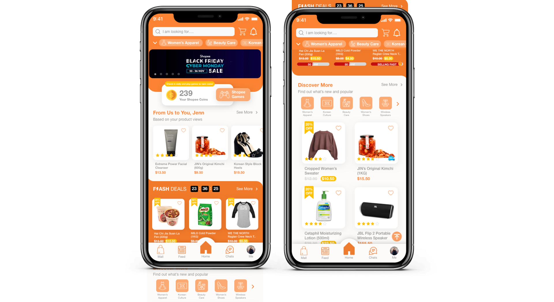
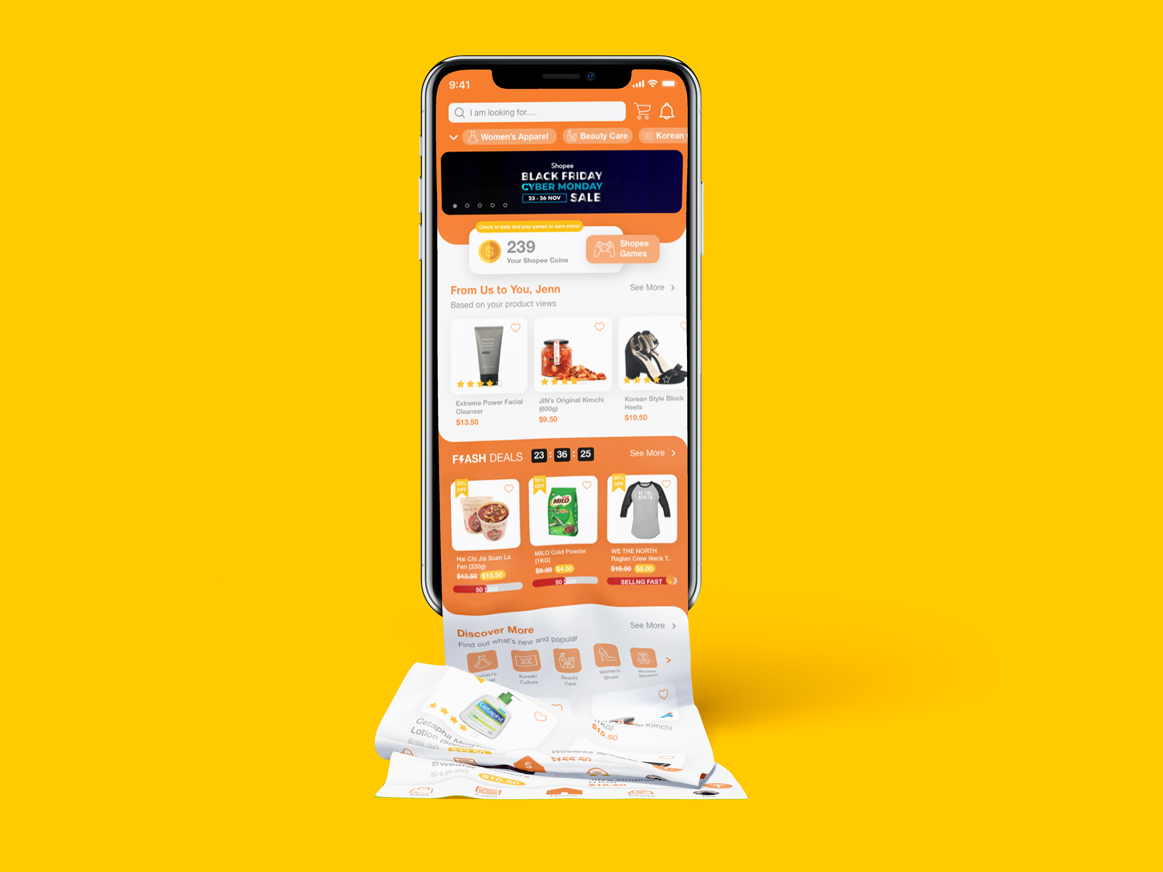
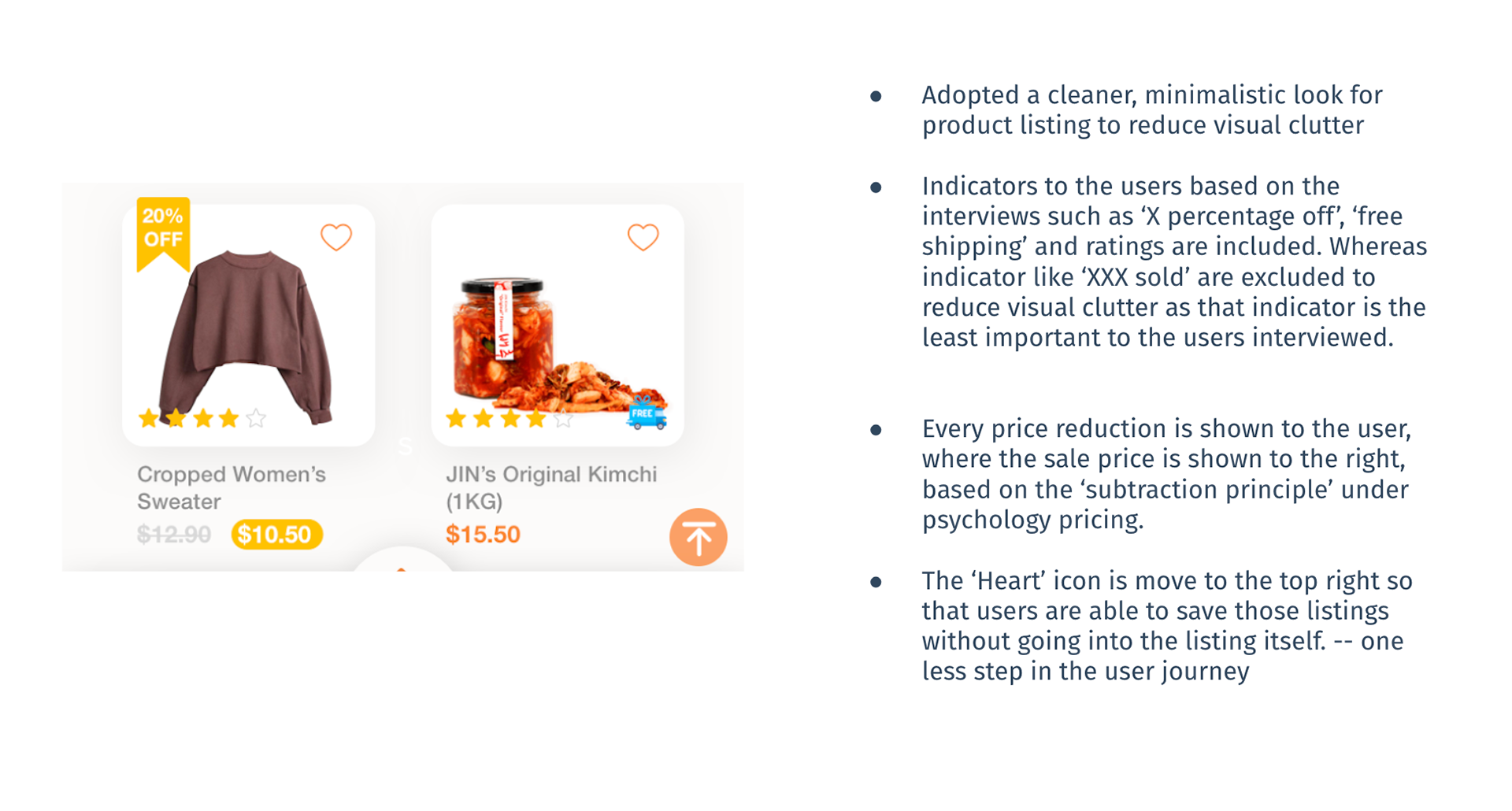
Redesigned Home Tab
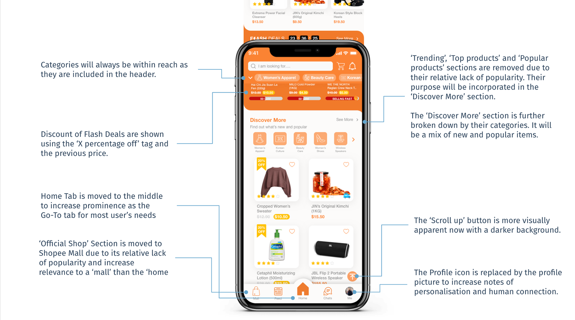
Redesigned Product Listing
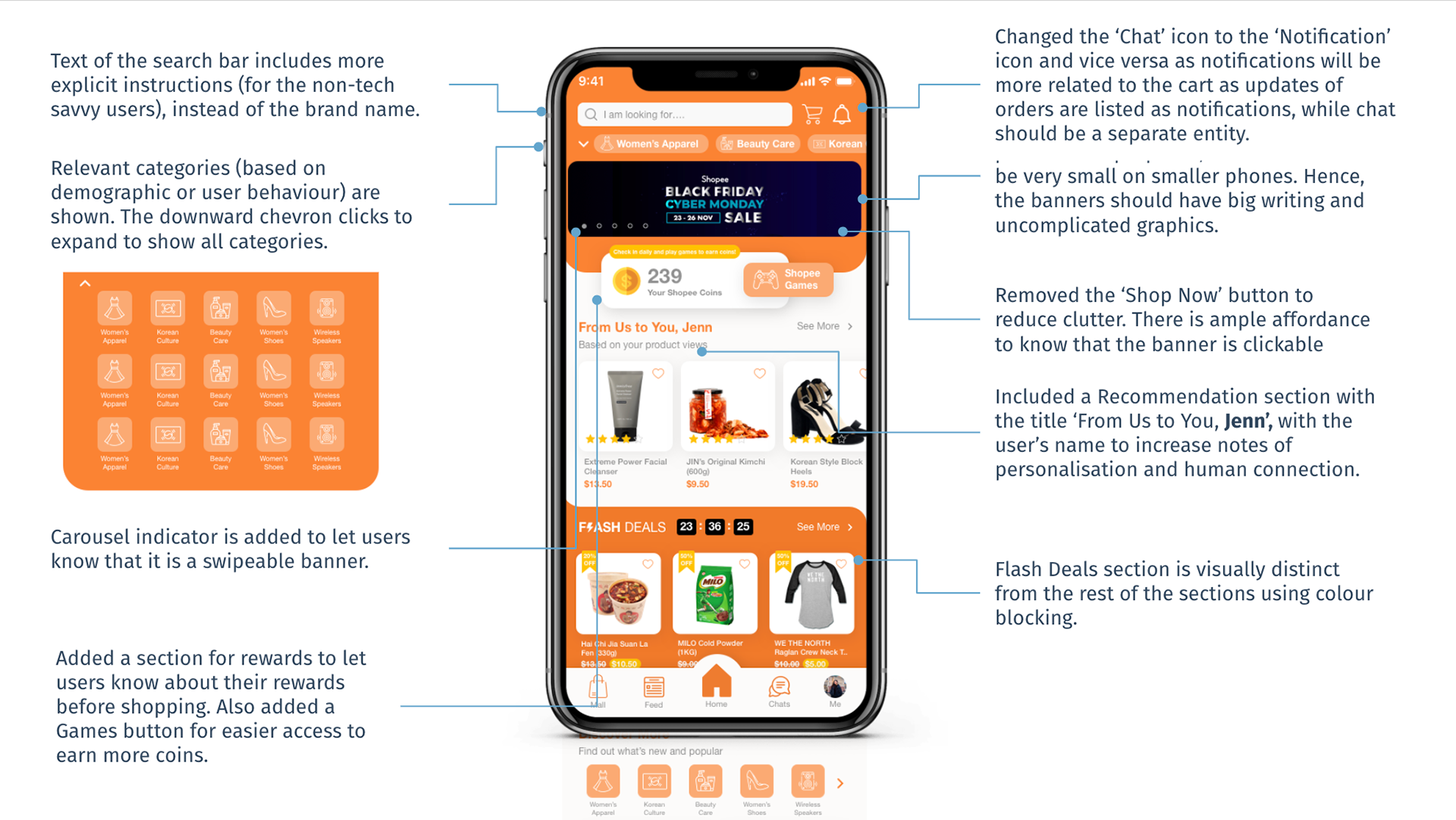
Step 5: Deliver
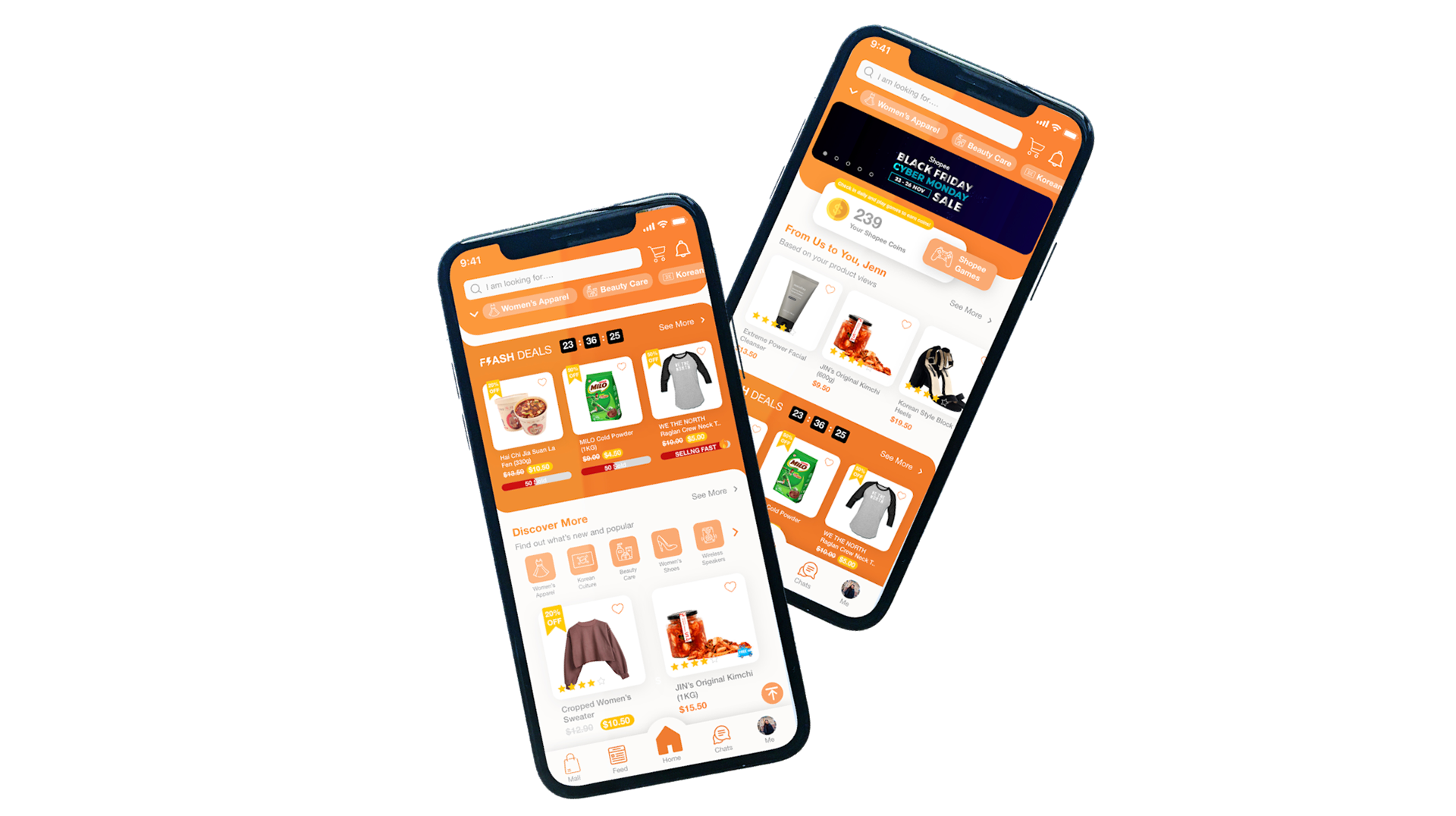
Final Visual Mockup
Final Takeaways
The short 48-hour challenge has allowed me to work fast and practice using many theoretical frameworks that I have learned in my classes. But if I was given more time and resources, I would work on more in the following areas:
1. Conduct User Testing on Prototype - Test and run iterations with users of different age group, tech-savvyness and interest
2. Interactive Prototypes - Could use tools like InVision or Marvel to test interaction
3. Delve Deeper into Branding and Mission - As I am unfamiliar with Shopee’s Branding Guidelines and Design Language System (DLS), the mockup could be modified to ensure consistency with the rest of the screens in the app.
For this challenge, I was offered a Spring Internship from Shopee in Singapore.