ACTLO
OVERVIEW
A community fitness app specially catered for elderly to exercise, explore, experience through interesting routes and communal outdoor activities.
This project is my team's entry to the weekend hackathon Hack For Gävle. The ideation to mockup process was done in 15 hours.
ROLE
Product Designer and Researcher
Product Strategy, Idea Generation. Product Conceptualisation, Visual Design, UI/UX Design, User Research, Pitching
DURATION
Feb 2020 (24 hours)
Background
Hack for Gävle is a weekend hackathon held in Gävle, a municipality in Sweden. The hackathon aims to find innovative solutions to the world's most prominent problems. My team and I decided to tackle the case given by Gäle Kommuns.
I was the sole product designer of the team along with 1 business developer and 2 product analysts. I was responsible for the product conception, UI/UX design.
Despite using only 15 hours, my team and I managed to achieve the following:
1. Conception of the Product - Despite not being natives in Sweden, we managed to understand and work on the problem through our case provider and propose a complete solution.
2. Executed End-To-End Design - I was able to effectively implement a design sprint to find out our target personas, ideate on the solution.
3. Achieving Top 4 - My team was one of the top 4 teams from the hackathon, attaining validation from the panel.
Understanding the Problem
The problem statement given by Gävle Kommuns is as follows:
"Can we, with technology, improve the well being of elderly people?"
Firstly, my team and I have to understand the problems behind the barriers of using technology to help the wellbeing of Swedish elderly. This is because we were not natives in Sweden, and will like to With the constraint of not being able to go out to ask real elderly in the streets of Gävle, we interviewed our case provider, an executive from the municipality office.
Then, my team and I conducted a brainstorming session, using the responses from the case provider, to identify the pain points behind Swedish elderly feeling isolated and lonely, especially as they retire.
1. Lack of common activities that can be done together - Swedish elderly tend to be very independent and do not take the initiative to go out to meet new people. This results in increased isolation as their social circle get smaller with time.
2. Interest in exploring outdoors - Sweden has many nature spots and archipelago where elderly would like to explore. However, their declining physical health has deterred them to go on exploratory journeys.
3. Lack of information sources - Activities for elderly in Sweden are commonly limited in their regions or type of activities, hence, it is difficult for the elderly to navigate information on the internet for different activities.
Defining the Product Vision
Using How Might We (HMW) framework, my team decided on the key questions that our solution is going to answer.
1. How might we help Swedish elderly to find common activities to do together?
2. How might we connect Swedish elderly and encourage a closer community?
3. How might we introduce physical activities for Swedish elderly that they can do based on their health to explore the Swedish nature?
Defining the MVP and Prototype
To answer the HMW statements, I led a quick design sprint to ideate on the key features that our solution should include.
1. Catering of elderly of different fitness levels - Users are able to indicate and test their fitness levels to ensure a right activity fit.
2. Planned routes to motivate - Users are able to follow routes to explore and experience in a form of a comfortable and encouraging fitness journey.
3. Social motivation to reduce loneliness - Users are additionally incentivised to complete activities with people. The more the merrier!
4. Rewards and Incentives to encourage constant utility - Users can be rewarded tangibly (with gifts and vouchers) or intangibly (leaderboards, friendship groups) with constant usage of the solution.
Designs of Prototype
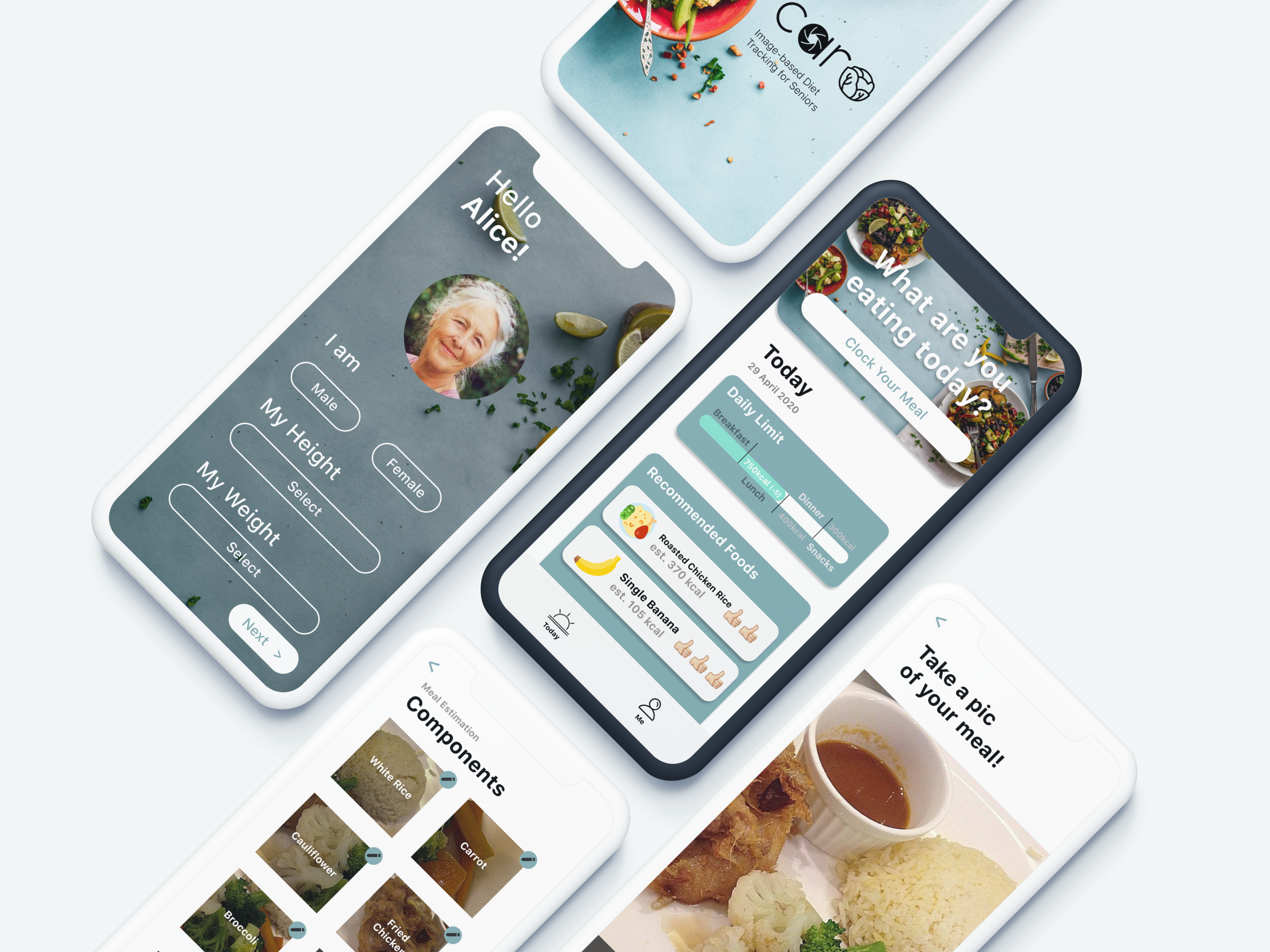
After deciding on the key features, it was time for me to start designing the screens. The aim is to provide an elderly-friendly interface with bright, big words and buttons, simple and encouraging language, audio and graphics.
Home Screen
The home screen starts with a friendly greeting and a list of recommendations for the user based on their location and activity level.
Activities Screens
Activities are categorised by Routes and Events.
Routes refer to physical walks or hikes to different scenic spots around the area, both nature and in the city. Before the user gets started, they are required to do an onboarding quiz so that our system will run data analytics to estimate the user’s activity level.
Corresponding routes will be open to the user as a form of assessment to gauge their actual activity level.
Events refer to non-physical activities that the user can partake in, such as art jamming and performing arts sessions.


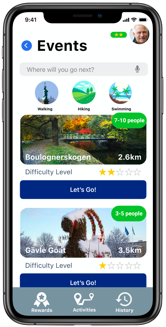
Activity Details Screen
Users are able to view more details regarding the activity. This will include a brief history of the place, difficulty of the activity and the limit of people that can go at the same time. All information are also available in the audio format for users who have visual impairment ailments.
Journey Screen
All routes and events will have an accompanying map to guide them to the meeting points. Google Maps will be integrated into the app to allow for accurate guidance for the users due to Google's already robust design for people with impairments. Every completed route ends with a selfie step to commemorate their fitness achievements. The image can be shared onto their own social media with their loved ones.
Additional points are given if they complete activities with other people. This would increase motivation to seek out nearby friends!
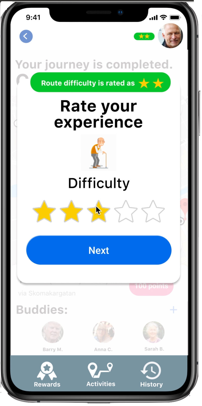
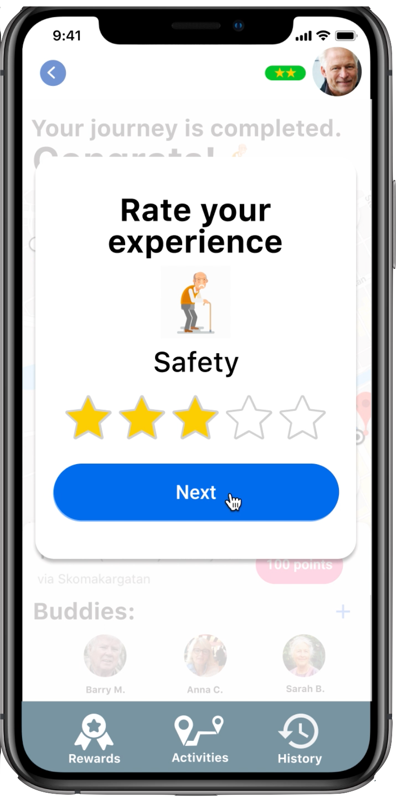
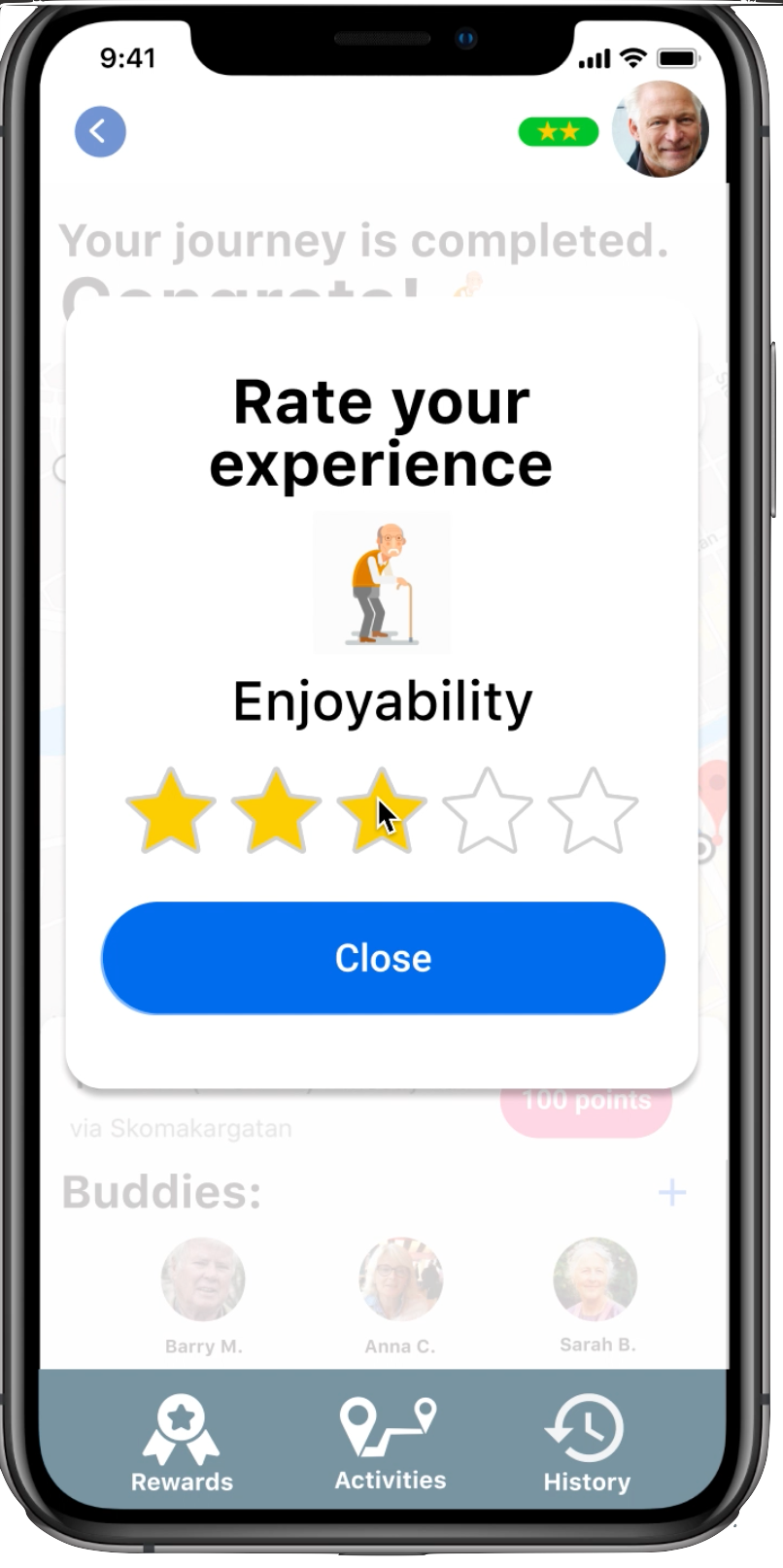
Feedback Popups
Based on their reviews on the routes taken, the system will be able to capture data and revise their activity level while providing recommendations for the future routes based on their feedback after each session.
Rewards Screen
Nothing incentivises constant utility of the app from conservative elderly with some rewards! Varying points will be awarded depending on length of route, difficulty of the activity and number of users the user goes with. Tangible rewards such as grocery vouchers, discounts to restaurants and other paid activities can be exchanged with points.
Prototype Demonstration
I then made the demonstration video using Invision to show our users how Caro works.
Final Takeaways
It was a test of efficiency and creativity to complete the entire process from ideation to presentation in 15 hours. But the power of sparkling water, caffeine and soft drinks definitely helped to achieve this feat. Here are some takeaways I have gained from this experience.
1. Focus on the problem - In a hackathon, the case provider is looking for the solution that best answers their problem. Showing that the team understands the problem and hence made a best fit solution will be a painkiller and win their hearts.
2. Keep things simple - As the pitch is only 7 minutes long, I have to eliminate some talking points about the solution and keep things very simple. Moreover, the panel can retain information from us for only so long.
3. Have quick iterations and be on your feet - As we only had a short amount of time to understand and solve the case, I have to keep the iterations quick. I have to be decisive and avoid striving for perfection as well.
